Mobile-First Microlearning Design for Retail
The main rules that make training usable during a real workday shift.
Mobile-first microlearning is not a trend anymore. It is the default environment where retail teams actually learn, especially in fashion, beauty, watches, and luxury: short breaks, constant interruptions, noise, shared devices, uneven Wi‑Fi, and the pressure of real clients waiting. If learning content is not designed for that reality, it will be ignored, no matter how good the pedagogy is.
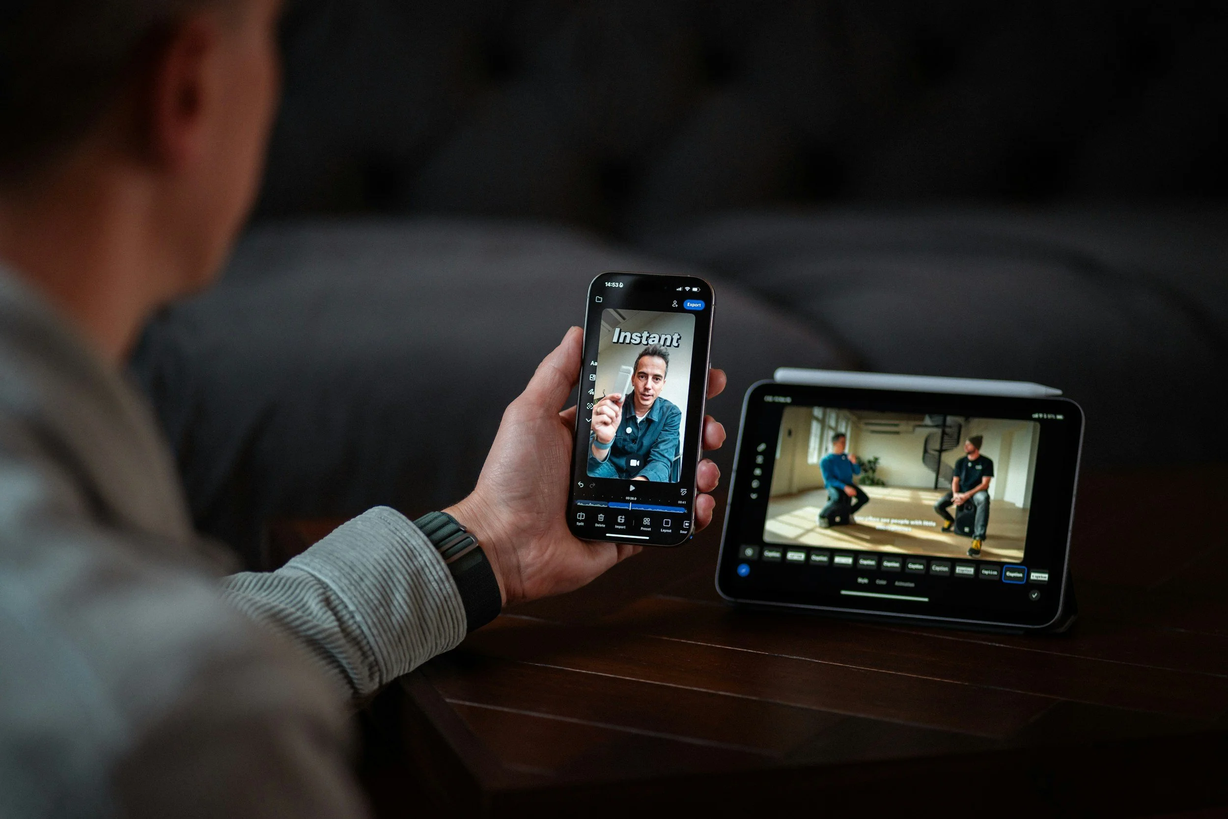
The strategic shift is that mobile learning is now part of operational excellence. It is not “L&D content delivered on a phone.” It is performance support that lives where the work happens. Penceo’s own positioning around retail-oriented micro formats and modern learning content aligns with this idea: mobile learning performs best when it uses short chunks, frequent interactive elements, and a visual-first approach supported by audio and video. The format is not the innovation. The innovation is building content that is frictionless enough to use in the micro-moments that actually exist inside stores.
This is a deep dive into the rules that separate usable mobile microlearning from “responsive eLearning.” A production guidance that can handed to designers, writers, and content owners. The goal is not to make content smaller. The goal is to make it sharper, faster, and more repeatable, so store staff can learn, apply, and repeat without feeling like they are stepping into a classroom.
Mobile learning requires a new mindset
Visual-first, short, interactive.
Mobile learning works when it accepts the truth of retail life: people are interrupted, time is fragmented, and attention is fragile. Designing for mobile is designing for human limits. This is not aesthetic preference. It is behavioral design: reading long text on a small screen in a noisy environment is simply a poor fit.
The mindset shift is this: on mobile, learners do not “study.” They scan, select, act, and return. That means your content must behave like a helpful tool, not like a lecture.
One key point at a time, because anything else becomes “later,” and later becomes never.
Minimal reading, maximum clarity, because store learners do not have the patience for dense paragraphs.
Frequent interaction to avoid passive scrolling, because scrolling is not learning and does not prove understanding.
Big tap targets and clear icons, because retail learners often use one hand and switch context quickly.
Offline or low-bandwidth friendly assets, because stores are not guaranteed to have stable connectivity.
Consistent navigation patterns, because every extra decision is friction and friction kills engagement.
Mobile-first is not “responsive design.” It is designing for interruptions, small screens, and real-world distractions, so training becomes usable support rather than an additional burden.

Writing for small screens
Copywriting is a valuable UX component
Writing is not a separate step in mobile learning. It is part of the interface. On a small screen, “your words are either a clear path or a wall”. If learners have to reread, zoom, or decode corporate language, you have already lost them.
Mobile writing in 2026 should follow three principles:
Compress, means shorter sentences and fewer words.
Clarify, means simple structure and concrete examples.
Activate, means the learner is always being invited to do something: choose, ask, try, apply.
Short sentences, strong verbs, because mobile reading is scanning, not deep reading.
One idea per screen, because multi-idea screens create cognitive traffic jams.
Use bullets, not paragraphs, because bullets match scanning behavior.
Avoid jargon unless it is brand vocabulary that the Maison actually wants repeated in store.
Use examples and micro-scripts, because retail behavior is language-driven (what you ask, what you answer, how you close).
Put the action first and explanation second, because learners want the “what to do” immediately.
Production tip (that changes everything): write your micro modules as if they were in-store cue cards, not as if they were pages of a manual. If the words cannot be spoken naturally to a client, they probably do not belong in retail training.
If learners have to zoom or reread, the lesson is too heavy. Mobile writing must feel effortless, because effort is the first thing retail teams run out of.
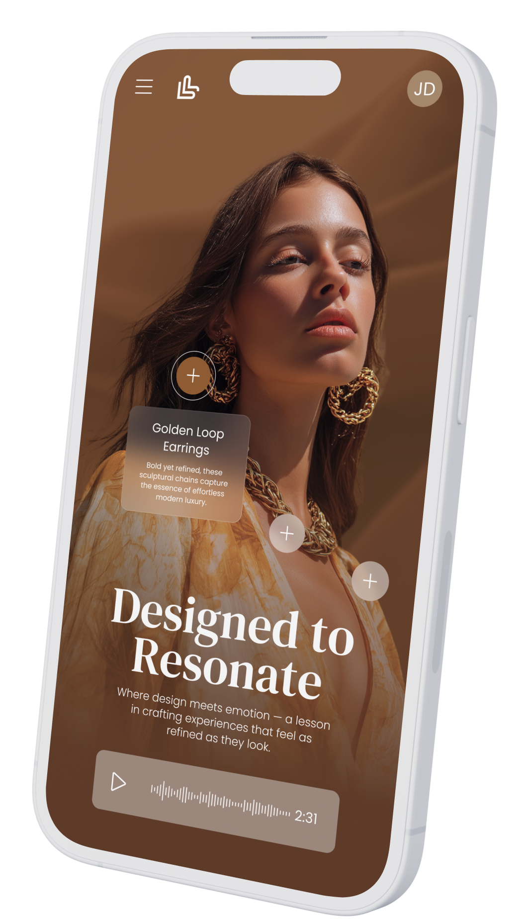
Visual hierarchy and brand design
Premium look, fast comprehension.
In luxury and premium retail, design is not decoration. It is credibility. Store teams are trained by the brand’s visual standards every day: campaigns, packaging, window displays, and boutique architecture. If your internal learning content looks generic, it communicates something dangerous: “training is not part of the brand.” If it looks intentional, it signals that excellence matters inside, not only outside.
Visual hierarchy is what makes microlearning fast. In a well-designed screen, learners know instantly:
What is the key message?
What should I remember?
What should I do next?
To achieve this, you need a design system for learning content, not only a brand guideline.
Use a clear typographic scale (title, key line, supporting line) so the eye knows where to land first.
Use brand color sparingly for emphasis, not for filling space.
Prefer icons and diagrams over long text, because visuals compress complexity.
Keep motion subtle and purposeful, because animation should highlight meaning, not distract.
Use real product imagery when possible, because authenticity increases trust and transfer to the shop floor.
Design for accessibility: strong contrast, captions for video, readable fonts, and layouts that do not punish older devices or tired eyes.
A practical creative-direction rule for 2026: design your microlearning like a premium “service card,” not like an eLearning slide. The difference is pace and restraint. Luxury equals clarity and calm.
In luxury, design is credibility. Mobile microlearning must look as intentional as the brand’s outward communication, otherwise learners will treat it as optional corporate noise.
Interaction patterns that teach
Tap, choose, compare, respond.
If your mobile learning is mostly scrolling, you have built content, not learning. Interaction is what transforms exposure into capability. It forces retrieval, decision-making, and reflection, all in a short time frame. This is especially important for retail, where the job is a sequence of decisions:
how to greet
how to discover
how to propose
how to handle objections
how to close
how to follow up
The right interaction patterns feel light, fast, and relevant. They also make content more engaging without needing gamification overload.
Two-choice dilemmas for service decisions: “Which response is on tone?” “Which action protects the Maison’s standards?”
Swipe cards for product comparison: materials, collections, finishing differences, price logic, use cases.
Hotspots on product visuals: tap to discover details, but keep targets large and avoid clutter.
Short fill-in phrases for selling ceremony practice: “Complete this discovery question,” “Finish the closing line.”
Confidence sliders to trigger follow-up: “How confident are you?” then direct learners to a reinforcement nano module.
Micro role-play prompts for manager debrief: one situation, one goal, one line to practice.
Interaction design rules that keep it effective:
Keep each interaction under 20 seconds.
Provide feedback that teaches “why,” not just “correct.”
Avoid trick questions that create defensiveness.
Use real client language and store reality, not academic phrasing.
Use one interaction per minute as a rough pacing rule.
Make failure safe: wrong answers should feel like coaching, not judgment.
Interaction makes learning active. Active learning is what turns micro content into behavior, because it trains decisions, not just memory.
Video and audio on mobile
Keep it light, keep it watchable.
Video is the natural language of retail training because it shows what text struggles to communicate: gestures, handling, service posture, pace, silence, and the “how” of the Maison.
Audio supports repetition and tone, especially for scripts, storytelling rhythm, and pronunciation. Penceo highlights audio and video advantages for engagement, flexibility, and self-paced replay, which is exactly what retail learners need.
But mobile video must be designed for the environment it will be watched in:
noisy stores
quick breaks
low attention windows
often without headphones
That means you build for silent viewing first and audio as a bonus.
Videos under 60 to 90 seconds for nano objectives, because long videos are skipped, not watched.
Subtitles always on by default, because many learners will watch silently.
Vertical framing when appropriate for phones, especially for quick demonstrations and face-to-camera micro coaching.
Clear sound and minimal background noise, because audio must be clean when it is used.
Visual cues that match what staff see in store: hands, products, counters, packaging, appointment settings.
Audio mini-lessons for commuting and brief breaks, especially for “one phrase” and “one story angle.”
Video formats that work exceptionally well in 2026 retail microlearning:
“One move” demo: show one gesture or one product handling step.
“One sentence” coaching: one line to use with a client, with tone and pace.
“Before/after” service: show the difference between off-tone and on-tone.
“Objection snap”: one objection, one calm response, one follow-up question.
“Detail spotlight”: one product detail explained visually in 45 seconds.
“Manager minute”: one coaching point delivered consistently across the network.
The best mobile video is not cinema. It is clarity with style, built for replay and immediate use, so it becomes a tool the team returns to, not a one-time broadcast.
Mobile analytics that matter
Find friction and fix it.
Mobile learning is measurable in a way traditional training never was. But measurement only helps if you track what reveals friction and relevance, not vanity metrics.
The objective is simple: remove anything that blocks access, comprehension, or repetition. When you do that, engagement rises naturally.
Drop-off points in lessons: where do learners abandon? That’s often where copy is too long or interaction is confusing.
Replay rates for key modules: high replay usually signals “useful,” not “easy.”
Quiz failure patterns by store type: department store vs flagship vs travel retail can reveal context gaps.
Search terms that reveal confusion: what people look for is what they need support on now.
Heatmaps by region or role: where adoption is low, investigate friction, not motivation.
Time-of-day usage: schedule releases when stores actually have micro-time, not when head office is online.
What to do with analytics:
Run a monthly “friction audit” on the bottom 10 modules
Rewrite, shorten, or reformat those modules.
Archive outdated modules aggressively.
Turn high-search topics into new instalearning content.
Use store feedback to explain the “why” behind the numbers.
Share wins: show stores how learning reduced errors or improved confidence.
Mobile learning is measurable. Use data to remove friction and refine content into something staff naturally use, because adoption is designed, not demanded.
Mobile-first microlearning
This is the retail standard in 2026, and design is the differentiator.
Mobile-first microlearning works in retail because it is built for reality: tiny time windows, real interruptions, shared devices, and the need for immediate application. Penceo’s view aligns with what store teams need most: short chunks, frequent interactive elements, and a visual-first approach supported by audio and video. But the difference between “we have mobile content” and “our teams actually use it” is design discipline.
Recap of the six pillars covered:
A new mindset: micro, visual-first, interactive, designed for interruptions.
Small-screen writing: one idea per screen, action-first, micro-scripts.
Premium hierarchy: brand design as credibility, accessibility built-in.
Teaching interactions: dilemmas, comparisons, prompts that train decisions.
Mobile video and audio: short, silent-first, replayable, store-realistic.
Analytics: find friction, refine continuously, and let stores guide content priorities.
Where Penceo can add unique value is in execution at scale: building the creative direction, templates, video formats, interactive widgets, and production rhythm that keep mobile microlearning both premium and practical. In retail, the thumb decides whether learning happens. When you design for the thumb, you design for adoption, and when you design for adoption, you build a learning culture that survives the pace of the shop floor.